Ashwani Sharma, Healthcare Data Analyst, and Dhirav Patel, Graduate Healthcare Data Analyst, explain how PHIN’s datasheets can be used to get a better understanding of private healthcare.
In their first blog post, Unleashing the power of data: Transforming healthcare for patients and providers Ashwani and Dhirav began to explain some of the more important aspects of data to help improve understanding for those who don't use data regularly. If you haven't already read that, we suggest you start there, before moving on to this next stage.
At PHIN, we are committed to transparency and continuous improvement in healthcare. To facilitate this, we provide information to the public in two forms, on the website search and the datasheets . The data offers valuable insights about hospitals, consultants, operations, patient feedback, and more. As such, these datasheets serve as a rich source of information for patients, healthcare professionals, and stakeholders in the private healthcare sector in the UK.
PHIN collects and analyses data from various sources, including healthcare providers and national organisations. By gathering this electronically, in digital format, PHIN is able to process and analyse large quantities of data, enabling us to produce meaningful insights that can be used to make informed decisions about healthcare.
Users can access PHIN's datasheets covering the quality, safety, and costs associated with hospital-based private healthcare services. They provide a wealth of information, such as patient satisfaction ratings, procedure outcomes, and hospital performance metrics.
While healthcare information may appear complex, we provide practical guidance to help users make sense of it.
By setting clear goals, identifying the key questions to be answered, categorising, and filtering the data, and regularly verifying assumptions, recipients can derive valuable insights from the analysis. This empowers them to actively monitor and improve the quality and safety of their healthcare services, ensuring informed decision-making and better overall outcomes.
We know that healthcare information can be unfamiliar to people and difficult to understand. However, this information can be made easier to use if you know how to interpret it (and to do so in the correct context).
To make interpretation easier, we have compiled a list of eight tips to help you understand our Datasheets:
- Define your objective: Before diving into the datasheets, determine what specific information or insights you are looking for. Having a clear objective will help you focus your analysis and find the relevant data. Let's say your objective is to compare the patient satisfaction ratings of different hospitals in your area. By clearly defining this objective you can focus your analysis on finding the relevant data related to patient satisfaction.
- Identify your questions: Formulate specific questions that you want the data to answer. Defining your questions will guide your exploration and make the data more actionable. For instance, you might want to know about the mortality rates by hospital or the number of readmissions for a particular procedure. These specific questions will guide your exploration of the datasheets and help you find the answers you're seeking.
- Start with the big picture: Healthcare data can be overwhelming at first glance. Begin by gaining a general understanding of the data by looking at summaries, overviews, or key statistics provided in the datasheets. This will give you an initial sense of the information available. For example, you can examine an overall satisfaction rating for each hospital, or the total number of procedures performed by a specific surgeon.
- Utilise filters and sorting: Data sheets often contain large amounts of information. Use the filters and sorting options provided to narrow down the data to the specific variables or categories you are interested in. This will help you focus on what’s relevant and make the data more manageable. Suppose you want to compare hospitals based on specific criteria, such as their location or specialty, use the filtering options to narrow down the data and focus on the hospitals that meet your criteria.
- Seek simplicity: Complex data can be simplified by breaking it down into smaller, more understandable parts. Look for patterns, trends, or commonalities within the data. Let's consider a dataset containing information about reported cases of an infectious disease in different regions. Instead of relying on visualizations, you can simplify the analysis by focusing on key variables such as the number of cases reported, the date of reporting, and the affected regions. By directly examining these variables, you can identify any significant changes in case numbers over time and compare the incidence rates across different regions.
- Pay attention to context: Context is crucial for interpreting healthcare data accurately. Understand the background and circumstances in which the data was collected. Consider factors such as demographics, timeframes, or specific conditions that may influence the data's interpretation. For instance, when looking at mortality rates, consider the age distribution of patients or any underlying health conditions that may impact the outcomes. PHIN’s datasheets contain caveats which are important to read and understand before using the data.
- Validate assumptions: It's important to question and validate any assumptions you may have while interpreting the data. Ensure that your assumptions are reasonable and supported by evidence. Regularly revisiting and challenging assumptions will help you maintain accuracy and avoid potential biases. Let’s say you assume that hospitals with higher patient volume tend to have better outcomes. Validate this assumption by examining the data and comparing the performance of hospitals with different patient volumes.
- Seek assistance if needed: If you encounter challenges or have difficulty understanding certain aspects of the datasheets, don't hesitate to seek assistance from experts or healthcare professionals. They can provide valuable insights and explanations to help you navigate the data more effectively.
By following these tips, you can approach healthcare datasheets with a clearer understanding and extract meaningful insights to support your decision-making and understanding of healthcare-related information.
Here's an example of how you can perform analysis on mortality data from the PHIN Data Sheet using Excel
To analyse the mortality (deaths) data from PHIN’s Datasheet for the period, first and download the relevant file . Open the file using spreadsheet software like Microsoft Excel. Look for the worksheet tabs named "MOR by Site" or "MOR by Nation" within the Datasheet. Locate the column(s) that contain the mortality data, these columns display the mortality rates or relevant information about mortality events.

Define your objective:
Determine the variation in mortality rates among hospitals.
Identify your questions:
Develop specific questions to guide your analysis based on the revised objective. For example:
- Which hospitals have the lowest mortality rates?
- Which hospitals have the highest mortality rates?
- Are there any notable differences in mortality rates between hospitals in different regions or healthcare sectors?
- What factors may contribute to the variations in mortality rates among hospitals?
Start with the big picture:
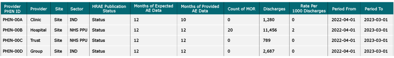
Review the data in the worksheet and make sure you understand the columns and their meanings (refer to the Field Definitions worksheet). Note columns such as "Site", "Rate Per 1000 Discharges", "Period From" and "Period To" as they provide relevant information for your analysis.
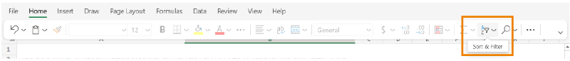
Utilise filters and sorting:
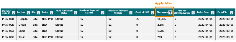
Use the Datasheet’s filtering and sorting options to focus on the data you need. Filter the data by specific sites or sectors to isolate the information that is most relevant to patients.
- For example apply the filter on the Sector column to filter the independent sites (IND), apply a filter on the Discharges column to unselect the “0” and “Blanks” values and sort the Count of MOR column descending.
- Then compare the values in the Rate per 1000 Discharges and Count MOR columns to see which sites have high or low mortality rates.
Calculate summary statistics:
Use Excel functions to calculate summary statistics that will help patients understand the mortality rates. For example, identify the sites with the lowest and highest rates, and determine the total count of mortality events.
N.B.: Remove the filters you previously applied to the columns. This ensures accurate calculations and prevents any potential discrepancies.
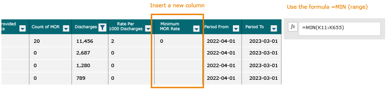
Identify the sites with the lowest mortality rates:
In a new column, use the formula =MIN (range) to find the site or sites with the lowest mortality rate. Adjust the range to represent the column of rates.
Apply a filter on the Rate Per 1,000 Discharges column to identify sites with a mortality rate of "0".
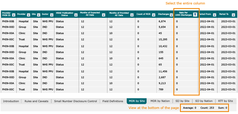
Applying the filter identifies 252 sites with a mortality rate of 0 i.e., they reported no deaths. Among these sites, 52 were NHS hospitals which treat some private patients (NHS Private Patients Unit or “NHS PPU”), while 200 belong to the independent (IND) sector.
Identify the sites with the highest mortality rates:
In another new column, use the formula “=MAX (range)” to find the site or sites with the highest mortality rate. Adjust the range to include all the rows containing the data you want to include.
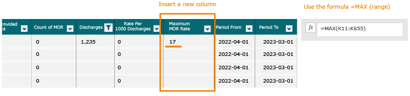
This indicates that the highest rate of deaths reported by at least one site was 17.
To identify all the sites that reported this number, filter the "Rate Per 1,000 Discharges" column using the value “17” and count the number of sites.
The formula to calculate the rate per 1,000 discharges is:
Rate = (Amount of deaths / Number of discharges) * 1,000
In this case:
Rate = (41 / 2410) * 1,000
Rate = 0.017 * 1,000
Rate = 17

Upon applying the filter, it becomes evident that "The Christie Private Care" stands out with a mortality rate of 17. It is noteworthy that this hospital belongs to the IND (Independent) sector and has reported a total of 2,410 discharges with 41 deaths (count of MOR). As discussed above, it is important to pay attention to the context, “The Christie Private Care” is a specialisation cancer centre. Cancer centres are known to handle complex and advanced cases of cancer, which inherently carry a higher risk of mortality due to the severity of the disease.
Analyse the data:
Explore the data further by examining specific sites or sectors of interest.
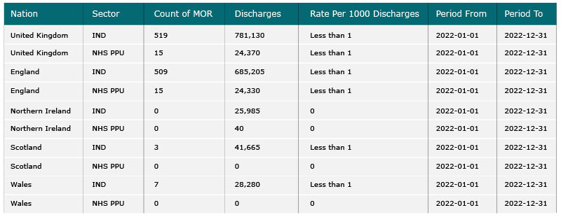
Investigate variations in sectors: Analyse the mortality rates separately for different sectors, such as IND and NHS PPU within each nation. Look for variations in overall mortality rates. This analysis can provide insights into the potential impact of different healthcare settings on mortality rates.
Consider factors influencing the rates: Consider factors that may influence the mortality rates, such as the number of discharges or the complexity of patient treated e.g. cancer patients. It is important to note that PHIN’s datasheets currently do not provide any context into the complexity of the patients treated. These factors can help explain variations in rates between sites or sectors.
For example, when examining the data, you can observe that the Count of MOR is relatively high for the United Kingdom and England in the IND sector compared to NHS PPU. However, for other nations, the Count of MOR is much lower. This difference is due to the smaller population sizes of these countries and the lower number of associated discharges. Additionally, if you compare the Rate per 1000 Discharges, it is less than 1 for all nations and sectors, indicating a relatively low mortality rate overall.
By conducting this analysis, you can gain insights into the variations in mortality rates between sectors and consider factors such as the number of discharges that may contribute to these variations.

Summarise the findings:
In summary, the analysis of the mortality rates in the dataset indicates that most of the rates are low, with most of them being less than 1 per 1000 discharges. This observation can be attributed to the fact that most private patients undergo planned (as opposed to emergency) procedures, which generally have lower mortality risks.
The analysis has provided insights by identifying sites with the lowest and highest mortality rates, allowing for further examination of potential differences in healthcare settings. Additionally, variations between sectors, such as IND and NHS PPU, have been explored to investigate the impact of different healthcare systems on mortality rates.
Conclusion
In conclusion, our efforts at PHIN go beyond providing just data. We are committed to helping patients, hospitals, consultants and others by improving their understanding of healthcare and empowering them to make informed decisions. Through the collection, analysis, and interpretation of information, we aim to assist patients in making better choices about their treatment options.
For consultants, our information and insights offer valuable feedback to help them identify and understand their strengths and weaknesses. By comparing their performance with their peers and analysing information related to adverse events, readmissions, and other key indicators, consultants can gain insights into their relative performance and areas for improvement.
Our goal is to bridge the gap between the publication of healthcare information and its practical use by patients and consultants. By providing accessible and understandable information, we empower individuals to take control of their healthcare journey, make informed decisions, and contribute to the improvement of healthcare services.
